
In a recent publication from the Brookings Institute economists Anne Case and Angus Deaton presented data showing drastic changes in mortality rates among Americans of various ethnic, racial and educational backgrounds. (Case and Deaton 2017) Mortality rates among White non-Hispanic Americans with a high-school education or less were highlighted specifically in the paper. The research, first presented in 2015 and followed by their most recent 2017 article discussed herein, coincides with news reports and political discourse reoriented around narratives of the white working class being “left behind” made possible by the unanticipated candidacy and election of Donald Trump, and neoliberal economic policy commitments from both political parties in the United States. [1] Increased mortality rates, the researchers suggest, signal states of despair 30 years in the making.
While they propose a number of possible causative agents (drug abuse, depression, etc.) stemming from shifting economic conditions, it is reasonable to say that they do not absolutely know if economic conditions were solely at the core for the states of despair. One cannot ask those directly represented by the data. One can only correlate the variables available in data and make historical comparisons, which the research does convincingly enough. Ultimately, the data most assuredly reflects real pain and a serious shift in American’s quality of life, and makes a solid, fact-based argument for strong correlation between educational attainment and mortality rate outcomes.
Things get a bit muddied, however, in Case and Deaton’s presentation when they make comparisons along racial lines. How some of their conclusions are articulated in narrative and graphically, based on data parsed through race, suggests a bias that distracts from fundamental conclusions. At times their paper implicitly buttresses a divisive narrative highlighting race and forgets that class structure, indicated in part through educational attainment, is the underlying correlate with mortality rate changes; that makes mortality rate changes a problem faced by the whole of the American working class, not just White-non-Hispanic Americans with a high school education or less.
I chose one figure in the paper in particular (Figure 1.1 excerpted from the article below), to illustrate my central point. I ask our readers to consider it along with some text, which I also excerpted below.
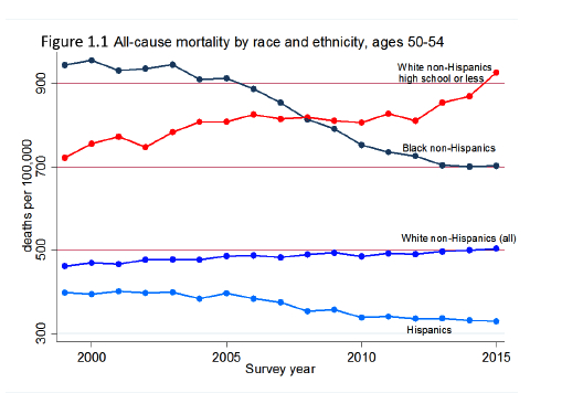 Figure 1.1 From Case and Deaton 2017
“ Mortality rates of black non-Hispanics have been and remain higher than those of white non-Hispanics as a whole, but have fallen rapidly, by around 25 percent from
1999 to 2015; as a result of this, and of the rise in white mortality, the black-white mortality gap in this (and other) age group(s) has been closing, National Center for Health Statistics (2016), Fuchs (2016). In this regard, the top two lines in Figure 1.1 are of great importance: mortality rates of non-Hispanic whites with a high school degree or less, which were around 30 percent lower than mortality rates of blacks in 1999 (722 vs. 945 per 100,000), by 2015 were 30 percent higher (927 vs. 703 per 100,000). [Emphasis mine] The same mortality crossover between black non-Hispanics and the least educated white non- Hispanics can be seen in Table 1 for every 5-year age group from 25-29 to 60-64; [Not shown] … Recent literature contains many references to poorly educated whites losing ground to other groups in various life dimensions, including to African- Americans; the mortality crossover presented in Figure 1.1 provides one dramatic example.
At the onset the researchers point out that their findings are “preliminary.” However, even with that caveat, it is still difficult for me to determine why the top two lines in figure 1.1 are singled out to be of “great importance” when the datasets those lines represent single out White Non-Hispanic Americans with a high school education or less for explicit comparison with Black non-Hispanics with their educational attainment variables all clumped together. Sure, the two plots at the bottom of the graph clump educational attainment variables for Hispanic and White non-Hispanic categories and can reasonably be compared to the Black non-Hispanic line, but that’s not what the authors say is of “great importance.” The narrative accompanying this graph almost literally says the graph’s data is important because Black Americans of any educational attainment are no longer the group dying the fastest. That because white non-Hispanic Americans with only a high school education are now the group dying faster, it is cause for concern. Would it be less concerning if Black Americans were still dying at faster rates?
The choice to present data in this way stands out to me so much that I wonder if it was done for rhetorical effect? In other words, why single out the comparison of White-non-Hispanic (with high school or less) to Black non-Hispanics (clumped together regardless of educational attainment) if not for the dramatic and persuasive impact of the “cross over” effect (or inversion if you prefer that term) in the mortality rate plots? If representational effect is what they were after, then maybe the researchers should have included the line showing Black-non-Hispanic (with high school or less educational attainment) mortality rates? They would have had to stretch the y-axis on figure 1.1 to over 1400 deaths per 100,000 to accommodate the significant spike in Black Americans’ (with high school or less educational attainment) mortality rates since 2010.
I created a mashup graph to show that by cutting the Black non-Hispanic line for ages 50-54 from Figure 1.2 (which I discuss further below) and pasting it onto where approximately it may have shown up in figure 1.1. This is what that may look like:
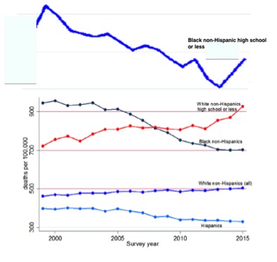
Presenting the data this way makes a slightly different visual argument. It’s very clear that mortality rate change is patently a malady affecting the working class, White or Black, and that very recently whatever improvement black working class Americans enjoyed in the their quality of life, they are losing. Like White Americans in the working class, they are seriously hurting.
Figure 1.2 in the paper (which I have also copied below) gives a much more accurate presentation of the data without the rhetorical panache, and is in my opinion, the most important bit of information if one is to compare race categories, educational attainment and mortality rates in the US.
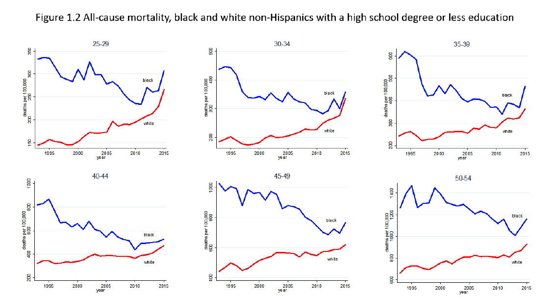 Fig 1.2 from Case and Deaton 2017
When considering figure 1.2 we can easily see that the rate of change in mortality rates for black non-Hispanic Americans and white non-Hispanic Americans of the same educational attainment was converging somewhat since just prior to 1995 across age groups. The paper mentions that in passing in the quote above. But as I mentioned previously, since about 2010 they diverged again, with the rate at which mortality rates for Black-non-Hispanics increased equaling or surpassing the rates of change in mortality rates for White non-Hispanic American (with high school or less education) across age groups.
What I’m trying to draw attention to is the rate of change over time of mortality rates across age groups from 2010 until 2015. For those of you who may remember your algebra and/or calculus, I’m talking about a comparison of the average slope of the lines in figure 1.2. In my estimation it looks as if, since 2010, rates at which mortality rates increased for Black non-Hispanic Americans (with high school or less education) either equaled or were greater than White non-Hispanic Americans (with high school or less education).
Why might rates of changing mortality rates be important to highlight? Because if the rates of change for mortality rates are spiking with Black Americans (with high school or less education) showing a more marked acceleration, then one can reiterated with confidence that whatever improvement Black Americans in the working class saw, it has been reversed and is more rapidly getting worse than any other group. Some may observe that the rates of change for mortality rates for Black Americans are equal in some age groups, and they show some convergence with white Americans, but that convergence has stopped since 2010.
Without looking at the raw data and a finer detailed graph of each age group one can’t give a detailed account, but approximations of the end points do make it clear that the “cross over” effect in figure 1.1 is an artifact and occludes important information.
A generous read of the authors’ choice to do this might say that it was necessary or else the negative impacts on the White non-Hispanic Americans (with a high school degree or less) would have been hidden in the line clumping them in with those with higher educational attainment. Certainly, but wouldn’t that point be made clearly without the rhetoric of “winners” and “losers” in reference to race? Wouldn’t the point be more generative if it was shown that White and Black Americans of the working class are united in how ultimately neoliberalism failed them?
Rather than illustrating a cross-over as Figure 1.1 does (i.e. trading places) looking at the other data (figure 1.2) and focusing on rates of change we can say that White and Black Americans with high school education or less aren’t trading places at all, they are beginning to occupy similar spaces in the graph even as race inequality continues. Why does that detail matter? Because it still points to the increase in suffering but more clearly makes the fundamental point that economic policies failed working class Americans with a high school education or less regardless of race and leads to the conclusion that the researchers and news media, by focusing primarily on the “cross over” rather than convergence when they constructed categories in figure 1.1, are reproducing a historical pattern in monopoly capital’s modus operandi for dividing the working class (e.g. along race lines).[2]
The working class has always been strongest when it is united. Labor history and sociology have shown this. Often monopoly capital has tried to divide the working class, using a number of tactics that “others” a group based on gender difference, trade vs. craft, and/or race. While I’m not arguing that Deaton and Case set out to do that as agents of the power elite, the narrative of trading places or “losing ground,” and highlighting race (without accounting for Black educational attainment or lack thereof in the comparison in figure 1.1) buttresses a divisive narrative. It argues for a picture of winners, losers and competition among working class groups that have historically had difficulty cohesively articulating their common needs for justice in fair labor practices.
Where the paper succeeds is in pointing out that educational attainment is a reliable correlate of damaging factors impacting mortality rates as a measure of quality of life. Deaton and Case close the quote above by saying: “to poorly educated whites losing ground to other groups in various life dimensions, including to African- Americans; the mortality crossover presented in Figure 1.1 provides one dramatic example.” Shouldn’t the argument be effective enough to say they have seen a pronounced increase in mortality rates? One could draw the conclusion that more sustained commitments to training and preparing our fellow Americans for the empty promises of neoliberal global markets could have saved some lives among working class Americans, black or white.
To be fair Case and Deaton do a great job at international comparisons drawing attentions to the US’s quickly diminishing position as a leader in the post-industrial West, but the inattention to the implications of how race is painted as divisive in the paper distracts. In sum, it’s not solely the racial crossover effect that makes increasing mortality rates worth noting. Rather it’s also the conclusion that there is rise in mortality rates due to failures on our system of economy and government to prepare working class Americans, white or black. It is distracting and problematic that Case and Deaton would think it’s a good idea to highlight race under the rhetoric of winners and losers and exclude data from figure 1.1 that would show that as of 2010 it’s the whole working class that took the brunt of the failures of neo-liberalism if we are using mortality rates as an indicator of that.
[1] The media coverage on the theme of “left-behind” is legion. One might start reviewing it here:
-
2016 election: Why the white working class ditched Clinton – CNN.com. (n.d.). Retrieved April 19, 2017, from http://www .cnn.com/2016/11/10/opinions/how-clinton-lost-the-working-class-coontz/
-
-Feeling Left Behind, White Working-Class Voters Turned Out For Trump. (n.d.). Retrieved April 19, 2017, from http://www.npr.org/2016/11/13/501904167/feeling-left-behind-white-working-class-voters-turned-out-for-trump
-
-Helm, T., & Editor, P. (2016, November 12). Jeremy Corbyn: US election result is “global wake-up call.” The Guardian. Retrieved from https://www.theguardian.com/politics/2016/nov/12/jeremy-corbyn-donald-trump-theresa-may-politics-marginalised
-
-Mapping the White Working Class. (n.d.). The American Prospect. Retrieved from http://prospect.org/article/mapping-white-working-class
-
-Swaine, J. (2016, November 9). White, working-class and angry: Ohio’s left-behind help Trump to stunning win. The Guardian. Retrieved from https://www.theguardian.com/us-news/2016/nov/09/donald-trump-ohio-youngstown-voters
-
-The white working class is another form of identity politics. (n.d.). Retrieved April 19, 2017, from http://www.newstatesman.com/politics/staggers/2016/11/white-working-class-another-form-identity-politics
-
-White, Working Class & Worried – CNNPolitics.com. (n.d.). Retrieved April 19, 2017, from http://www.cnn.com/specials/politics/white-working-class-and-worried.
-
[2] I reiterate, is a projection based on comparing the graphs presented in the paper. Without the raw data it remains a rough approximation or “eye balling” where I would imagine the data would plot.
[2] See Roediger, D. R. (1999). The Wages of Whiteness: Race and the Making of the American Working Class. Verso
ERRATA: Angus Deaton’s name was misspelled in a previous version of this article. It is Deaton not “Dutton.”