My book, Taking Our Country Back: The Crafting of Networked Politics from Howard Dean to Barack Obama, was just published in the Oxford Studies in Digital Politics series edited by Andrew Chadwick.
This was going to be the cover of the book, until the 2012 Obama campaign denied my request to use a screenshot from the 2008 website:
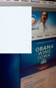
This mock up is a screen shot from the homepage of the 2008 campaign taken soon after Obama won Iowa. I wanted to use it because the design is so impressive, the product of an exceptionally talented team of in-house designers, John Slabyk and Scott Thomas (Thomas published a book of the graphic design from the campaign, available here).
I love the image because it is how we remember the Obama campaign from that cycle (see if you recognize the way the site looked throughout much of 2007). I spend a considerable amount of time in the book talking about all the visual design work that went into the campaign. The original site was purposively redesigned in advance of the Iowa caucuses, on the theory that if Obama did well, people who had been inattentive to the primaries would immediately go to the campaign’s website to seek out more information about the candidate.
The goal of the redesign was to appeal to these uncommitted but curious voters, as well as to inspire new supporters to get involved with the campaign. The designers subsequently developed elements of this redesign into four core “brand groups,” or visual genres intended to create particular understandings of the candidate and campaign among the public.
The first of these brand groups was the “general” campaign brand, which featured the iconic Obama blue, the campaign logo, and Gotham font, a typeface which Thomas says was selected for its “truly American qualities.” Designers hoped that the consistency of this brand would provide the visual impression that the candidate, the young junior senator from Illinois, was an efficient, experienced, and competent executive. To create this brand consistency, the campaign’s New Media Division gradually assumed responsibility over the design for the entire campaign, creating one consistent Obama “look” across the campaign’s media and at all public gatherings for the candidate throughout the country.
For example, if you look closely at this website and compare it with public appearances of the candidate, you will note that staffers matched the font and color blue across the website, placards, podium signs, door hangers, the wrapper around the campaign’s plane, and even Obama’s necktie. In other words, this was not accidental.
In addition to the standardized general campaign brand, designers worked on creating distinct brand groups relating to Obama as a candidate, his campaign, and the historical moment. These centered on guiding voters to imagine Obama as president, his run as the historic extension of the founders’ vision and the civil rights movement, and their own roles in American democracy. For example, designers created a “timeless” theme to help citizens imagine Obama as president. This entailed the explicit design of materials to resemble official state documents and to evoke state imagery, such as the white textured background on the website that designers used to suggest governmental buildings in Washington, D.C.
The designers used the “instant vintage” brand group to evoke the American past and to suggest, through imagery, the historic nature of the campaign. To do so, they went through archives of historical documents and images and pulled elements into the campaign’s design. Designers, for instance, presented materials in the style of the Declaration of Independence and drew upon imagery of the civil rights movement, including the creation of stylized and prophetic images of Obama. A supporter theme involved tailored versions of the campaign’s logo for different supporter demographic and affinity groups such as African Americans for Obama, Obama Pride, People of Faith for Obama, and Kids for Obama.
My original idea was that using the screen shot as the cover would be a perfect illustration of the ‘craft’ that goes into networked politics. Indeed, it is easy to overlook this sort of work, or to undervalue it, if we just focus on the affordances of tools or independent supporter actions.
Unfortunately, however, I was not able to use the screenshot, which the 2012 campaign cited its copyright over in denying my request. I was always being asked to own a piece of the campaign – I guess just not this piece. Because it was for the cover, and therefore would inevitably be used for marketing, Oxford wanted me to get permission to use the screen shot from the 2008 campaign.
We attempted to get this permission, but were denied. The response, from the current campaign’s counsel was, in effect, that they receive a lot of these requests, but that because they do not have the staff to vet the accompanying content, they usually say no.
The issues around fair use and how the risk of suits often engenders self-censorship are well detailed. Namely, this is more about what my publisher feels comfortable with given a possible suit than what may be legally permissible for a transformative use of a screenshot that has no commercial value.
The broader point is not about my book, but about the fact that it seems well past the time that all political content of this sort (that which is used in the conduct of democratic and public elections) be licensed under a Creative Commons public domain license. Such a license would permit bloggers, citizens, authors, etc. to use the materials that campaigns produce freely without fear of copyright violations. Even more, I think there is a case to be made for broad latitude around the remixing of all content produced in the course of democratic elections. As we saw with the Shepard Fairey Hope poster, derivative works can be enlisted in an extraordinary range of projects (some counter to the original intent, some entirely new) – all of which further robust democratic debate.
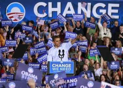
In the end, I love the cover that I ended up with for different reasons – in no small part given the irony that it is a purchased AP photo:
