
I came across this post at ProfHacker a while back about a new tool called Hoaxy. The tool allows you to visualize the spread of claims and fact checks online. Of course, the biggest potential use could be in visualizing the spread of fake news.
The writer at ProfHacker quoted the FAQ on the website,
Hoaxy visualizes the spread of claims and related fact checking online. A claim may be a fake news article, hoax, rumor, conspiracy theory, satire, or even an accurate report. Anyone can use Hoaxy to explore how claims spread across social media. You can select any matching fact-checking articles to observe how those spread as well.
We track the social sharing of links to stories published by two types of websites: (1) Independent fact-checking organizations, such as snopes.com, politifact.com, and factcheck.org, that routinely fact check unverified claims. (2) Sources that often publish inaccurate, unverified, or satirical claims according to lists compiled and published by reputable news and fact-checking organizations.
Here’s a quick graph of Twitter claims over time and retweet networks related to the “pizzagate” conspiracy.
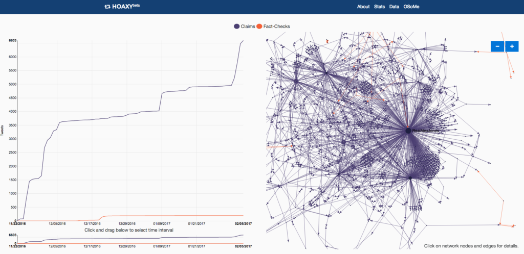
A screenshot of Hoaxy graphs about pizzagate.