“…maps give us, reality, a reality that exceeds our reach, our vision, the span of our days, a reality we achieve in no other way. ”
So wrote Denis Wood when discussing how maps construct our reality (Wood, 2016). Maps are tools for knowing the world but also, ways of knowing it. They communicate what some of us know while helping others trek into an unexplored territory and plan a way forward. They can guide us, define what we know, and predispose us to expect one outcome or another. One sort of map that does those things is the political map/infographic used in political news reporting.
As many regular visitors to news sites across the web already know, maps in many news stories related to the 2016 election reported data referenced in or inspiring the story written. The information presented by those sorts of maps, while dynamic and accompanied by the text of a news story, is nonetheless often two-dimensional. The underlying idea here is that, as much as anything else they do, maps and/or infographics in news stories are also making arguments. They are visual rhetoric. In this case, maps like the ones I’m discussing are making visual arguments by means of enthymeme. For those that may be wondering, an enthymeme is a proposition in argumentation where the causative link or premise leading to a conclusion is not explicitly stated but implied, leaving the listener or reader to draw the preferred causative link or premise based on the presentation.[1]
Obviously it wouldn’t be a very good visual argument if the reader were left to draw any causative link whatsoever, so visual presentation has to subtly guide him or her to the conclusion the would-be persuader desires by drawing on pervasive cultural or linguistic referents not obvious in the argument. The use of enthymemes in the case of political maps and infographics call forth a particular cultural or historical repertoire[2] that can suggest what is the likelihood of having commonality with those that live in a same state or town or what are the opportunities for discursive engagement. To understand how those arguments are made it serves us to explore methods and intent. So we ask: What are the conventions used and what are the arguments being made exactly? What is the cultural/historical repertoire being called forth to give political maps their persuasive power about facts and potential outcomes? We begin by digging into this first set of questions below.
Culture and History of Map/Infographic Conventions
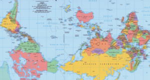
 Maps and infographics as rhetorical devices use conventions to guide readers to conclusions about what is going on. Those conventions could be design choices about color, perspective and orientation in the visual field, and those conventions are situated in culture. A commonly cited illustration of a culturally situated convention in map drawing is that of the inverted Western Hemisphere. When viewed for the first time it is both disorienting (the viewer needs a moment to figure out what land masses are being shown) and makes us realize that what we understand as the “natural” arrangement of things is actually a convention of Western cartography.
One might argue that those conventions are extensions of the left-right/top-down Western reading conventions, but one can also argue that, when presented in images, they have other meanings too. The culturally situated referents about power dynamics, for example, may be called forth in a viewer’s mind. They can be summed up in common aphorisms like “king of the hill,” “top notch,” “head and shoulders above the rest,” “above and beyond,” etc. Those trite expressions illustrate how we tend to understand the “power position” in the visual field and point to a specific cultural referent that make the visual argument about power implicit.[3] Because that position is not necessarily shared with others, threats to it must come from below. Political change that challenges power, for example, is spoken of as “grass roots” or coming from the “bottom up.”[4]
Modern conventions for graphical representation of data (in maps or infographics) have been with us for some time and are typically established by a number of factors stemming from professional “visual discourse communities” like graphic designers, data scientists, journalists or marketing firms. A significant amount of historiography and visual rhetorical analysis exists documenting the emergence of those conventions at the turn of the 19th Century in the U.S. That research shows that shifts in conventions followed changes in demographics, economy and technology (Kostelnick, 2012). While some conventions persisted over time, novel ones have come about as a result of interactive interfaces on the web.
The NY Times maps/infographics leading up to and after the 2016 presidential campaign are good examples of novel conventions stemming from technological changes that intersect with existing elements of our cultural repertoire. The now ubiquitous red vs. blue (RvB) electoral maps, for example, started being used in news reporting in 1976 by NBC. Back then red and blue states as we understand them today were reversed, and blue was a designation for Republican, while red was for Democrat (“The Color Of Politics,” n.d.). It wasn’t until after the contentious election of 2000 when they became solidified in the national consciousness in the current meaning. But what details are buried in the binary of RvB, and how does that help make one argument as opposed to another?
When the Devil is in the Details
It is undeniable that the RvB designations have become a culturally significant way for how we understand political divides in the US, and define conventions for representing them both at the state and national levels. [5] If in casual conversation, for example, one should note that, “Texas is a red state,” one can be sure most people will know what that means. On the other hand, I don’t think one could find many who know what that might mean in detail. In other words, while some may recognize that RvB maps are generalizations about states’ different political majorities, readers wouldn’t know what it means “on the ground” just from the map or infographic.[6]
While maps/inforgraphics in this regard may be useful, they nonetheless create generalizations about what are actually mosaic-like distributions of political identity defined by a host of factors, some of which are contradictory. In a time when our nation is starkly divided, that might not be the most useful way to accurately present how our differences are manifest in national geography. Bill Bishop’s correct assertion that we are self-sorting (Bishop, 2009) leaves one thinking that RvB political maps are generally accurate pictures, but they in fact yield over simplifications of more nuanced political divides, making an implicit or purposeful argument for “us over here and them over there.”
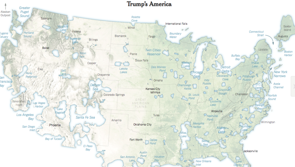
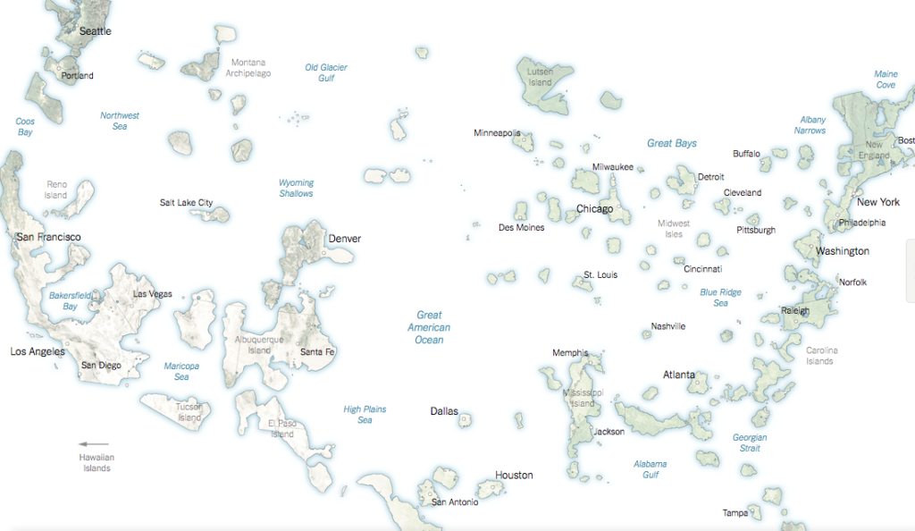
As a particularly salient example of how maps make that sort of argument take the maps accompanying this paragraph, taken from a NY Times article (Wallace, 2016). Wallace’s article was meant to illustrate how division is growing between the rural Republican America and the urban Democratic one. The maps showed either small islands of land or puddles of Democratic Party strongholds engulfed in huge swaths of land or ocean representing the vast rural Republican expanse. But topographic transmutation of the “voting will” into a water world doesn’t tell a story of a nation equally div ided between the pastoral countryside and the urban cityscape. It purposefully or inadvertently deploys an implicit reference to the daunting size of one group and the relative isolation of small enclaves of another. Was this a David and Goliath narrative? Were the small blue islands supposed to stand against giants in red? That seems generally a hopeless proposition. Why represent the division in this way? As a form of stylistic flare? In the end the maps really didn’t tell the whole story and implied impossible conditions for reasonable resolution.
But voting districts and states are not a monolith. Looking at the actual district voting data one could see that some were quite evenly divided. So one map might show a swath of land all red yet the raw data suggests it was more like a pinstriped region. Yes, certainly more red than blue but not overwhelmingly so. If that’s the case how can we be so hopelessly divided or beyond conversation, and why paint it that way? The devil in the details is far more encouraging than the arguments for a starkly divided country. My interpretation of the argument made by those maps exemplified in the figures above is not a case of me trying to ignore an empirical truth. When we dig beneath the window dressing of journalistic authority and data presentation we find we’re not unlike Michael Burry from the film the Big Short. That beneath the very persuasive visual binary, there’s a much more complicated picture that isn’t so divisive.
Maybe the Devil in the details is not so devilish as to be avoided. If more maps proposing a more nuanced social world were used as standard ways of communicating how the country’s regional differences translate into overlapping political environments, perhaps Americans would see how the self-sorting they hope to do as they move or as they stay in one region or another can be done as a form of strategic integration or engagement. In that sense maps won’t be viewed as arguments that inform one on how to retreat or flee to areas of political safety, but rather hopeful narratives of where areas of productive engagement with opposing political viewpoints might be possible. Or better yet, they may inform us that while we may occupy one singular political life-world, because we occupy many life-worlds some of them may over lap with our neighbors in other ways. Importantly, cartographic color conventions and generalizations about complex data are not the only factors that give RvB maps their power to convince a reader that divisions are stark and that sorting ourselves is the best option.
The Context of Technology and Culture for Visual Arguments
The RvB map binary illustrated above, arguing for a divided nation is, for example, buttressed by another binary about the outcomes of the 2016 election that trades on the “rural versus urban” (UvR) divide. By framing the divide as UvR, that narrative legitimates the RvB divide by explaining the cultural differences underlying red or blue states. But that narrative isn’t new. It is a reference to an older item in our cultural repertoire. Thomas Jefferson wrote extensively about it in Notes on Virginia (Jefferson, 1783). Centuries later Leo Marx, working in the tradition of the Myth and Symbol School in American Studies, tied Jefferson’s ruminations to other thinking from the 18th Century in his classic The Machine in the Garden. There Marx showed UvR cultural divide to be an outcome of the tension in between the “pastoral ideal” and early industrialization in the US (Marx, 1964). Most recently Colin Woodard proposed a political geography not so easily reduced to the binary of pastoral/urban or machine/garden, but one constituting 11 different national cultures stemming from colonial origins and Western expansion, thus complicating Marx’s conclusions further. (Woodard, 2012) In short, we should conclude that while a cultural binary is an easy and persuasive tool for understanding the US as divided, it is not a robust measure of political dynamism. Shifting and overlapping cultural histories continuously re-draw political maps. Therefore when looking at political maps showing blue or red regions, occupied by liberal or conservative people, depending on their proximity to large cities, the concentration of blue or red political leanings is not as monolithic as the maps and infographics present.
Other long-standing narratives (visual or discursive) also frame the argument of division reified in RvB maps. Data graphics illustrating immigrant migration in the late 1800s were purposefully made to generalize details in the data and suggest not a divisive argument but one of uniform integration. Charles Kostelnic observed, “because the equally sized charts [in the statistical atlases of the US in the late 19th and early 20th Centuries] show only the relative concentrations of foreigners within a given state, they obscure the fact that some states had very high concentrations of certain ethnic groups” (Kostelnick, 2012). Thus early American infographics’ devils-in-the-details were more telling but less persuasive, so data graphic designers presented that data to suit their persuasive ends.
Again if news sources are going to use maps/infographics, shouldn’t they be more informative about the complexity of our political mosaic rather than present stark binaries? Isn’t it more accurate to represent our political tensions less like clearly defined boundaries and more like shared spaces, and in so doing argue for the complex social and culture integration that can happen at the ground level? Since PA in 2016 was pictured red when in previous years it was blue, it struck me as odd that it was represented so starkly divided in RvB maps. I thought I’d try to re-draw that map, making it more descriptive of the states micro-level complexities. In the next and final post in this series I’ll develop other types of visual interactive arguments that are less built on binaries and more on overlapping life-worlds.
Footnotes
[1] This form of subtle persuasion is especially effective if the argument is counter to what the audience already believes. People will instinctively resist being persuaded even by the most obvious truths if they don’t agree with them or if the persuader commits an affront to a listener’s identity or what Irving Goffman called “face.” (Goffman, 1959) This is why news coverage and discourse referencing voters not likely to vote for Clinton as “uneducated” or “deplorable” was patently foolish and detrimental to Clinton in 2016.
[2] A cultural repertoire is a sort of menu list of the various signs and codes unique to a culture that allows for a common semiotic language that can be explicit or implicit.
[3] I am not alone in this interpretation. Commenting on the visual rhetoric for infographics or maps from the late 1800s Kostelnick noted “visual language develops within discourse communities that enculturate its members in its conventional codes, and those codes embody cultural values and norms, including aesthetics” (Kostelnick 2012)
[4] As a native Spanish speaker I cannot think of any linguistic or culturally situated conventions in which top and bottom are used in the same way in Spanish as they are used in US English.
[5] I’m not the first to point this out of course. Most recently Bill Bishop points out that that the divisions in US demographics cannot easily be boiled down to the RvB narrative but that they still serve to orient us toward a vision of what the US looks like politically bellying important details. (Bishop, 2009)
[6] To be fair many news stories do delve into the minutia of data but if a picture is worth 1000 words then readers may not get that far into the analysis.
References
Bishop, B. (2009). The Big Sort: Why the Clustering of Like-Minded American is Tearing Us Apart (1 edition). Mariner Books.
Goffman, E. (1959). The Presentation of Self in Everyday Life. Doubleday.
Jefferson, T. (2011). Notes on the State of Virginia. UNC Press Books.
Kostelnick, C. (2012). Melting-Pot Ideology Modernist Aesthetics, and the Emergence of Graphical Conventions: The Statistical Atlases of the United States, 18 74-1925. In C. A. Hill & M. Helmers (Eds.), Defining Visual Rhetorics. Routledge.
Marx, L. (1964). The Machine in the Garden: Technology and the Pastoral Ideal in America. Oxford University Press.
The Color Of Politics: How Did Red And Blue States Come To Be? (2014, November 13). Retrieved December 30, 2016, from http://www.npr.org/2014/11/13/363762677/the-color-of-politics-how-did-red-and-blue-states-come-to-be
Wallace, T. (2016, November 16). The Two Americas of 2016. The New York Times. Retrieved from https://www.nytimes.com/interactive/2016/11/16/us/politics/the-two-americas-of-2016.html
Wood, D. (2016). Rethinking the Power of Maps. Guilford Press.
Woodard, C. (2012). American Nations: A History of the Eleven Rival Regional Cultures of North America (Reprint edition). New York; London: Penguin Books.

